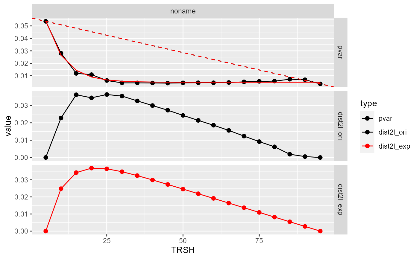
Currently two methods have been implemented to get the "keen-point" from the variance(y) - threshold(x) curve. One is to use the original y values to draw a straight line between the lowest x value (p1) to highest x value (p2). The knee-point is the x that has the longest distance to the line. The other one is to fit the data first then use the fitted responses to do the same analysis. Currently the first method is preferred.
Arguments
- d
A tibble.
- xaxis
The column name in the
dto be the x-axis in the exponential-like curve- yaxis
The column name in the
dto be the y-axis in the exponential-like curve- p1
Default = NULL, or an integer value to manually set the first index of line.
- p2
Default = NULL, or an integer value to manually set the last index of line.
- plot
Default = TRUE, plot the diagnostic plot.
Value
A list with two components: stats and outcome.
stats: a tibble, including pooled variance (pvar), fitted responses (y_exp_fit, y_lm_fit), distance to the line (dist2l)
outcome: a tibble, including estimated BMRs (bmr)
; Suffix in the stats and outcome tibble: "ori" (original values), "exp"(exponential fit). prefix in the outcome tibble, "cor" (correlation between the fitted responses and the original responses), "bmr" (benchmark response), "qc" (quality control).
Examples
inp <- data.frame(
x = seq(5, 95, by = 5),
y = c(0.0537, 0.0281, 0.0119, 0.0109, 0.0062, 0.0043, 0.0043, 0.0042, 0.0041, 0.0043, 0.0044, 0.0044, 0.0046, 0.0051, 0.0055, 0.0057, 0.0072, 0.0068, 0.0035))

out <- cal_knee_point(inp,"x", "y", plot = FALSE)
plot(out)
#> $`1`
#> Warning: Removed 38 rows containing missing values or values outside the scale range
#> (`geom_line()`).

#>
#>